Cup of Jos
Client: Josie Brothers of @cupofjos
on Instagram
Project: Branding and Packaging
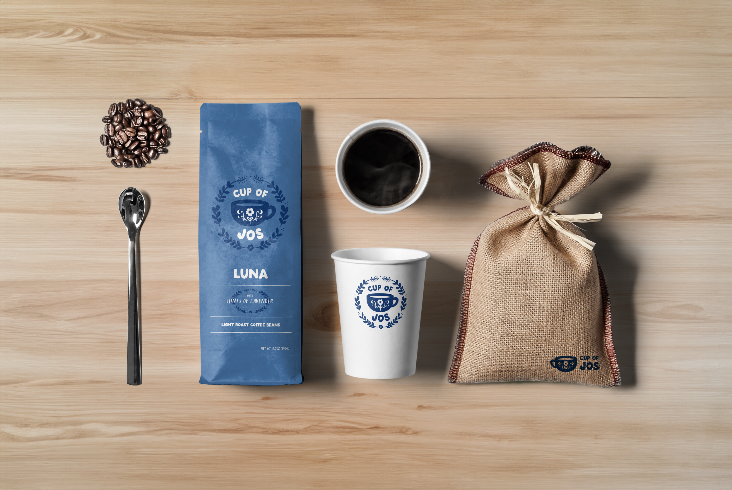
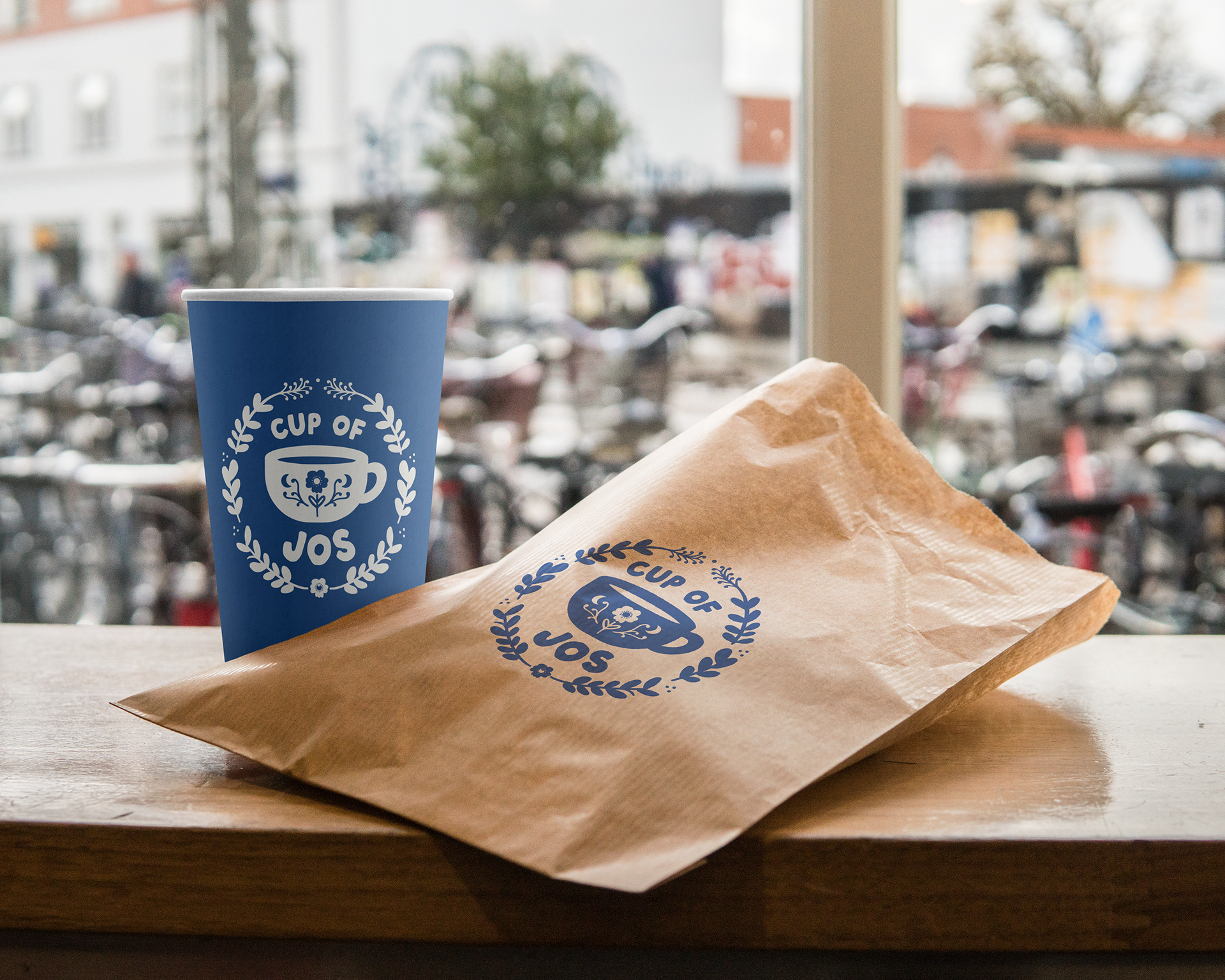
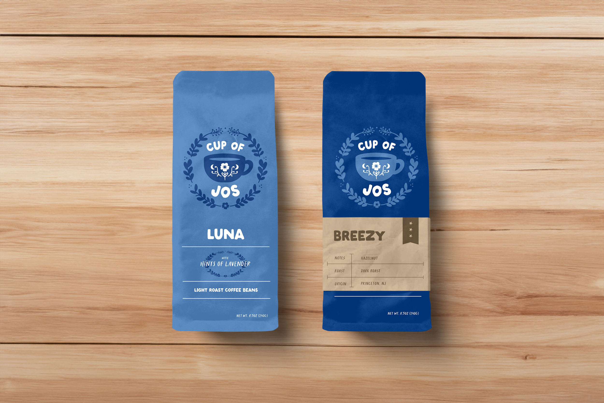
"Cup of Jos" is a branding and packaging project inspired by the @cupofjos Instagram account, transforming into a vibrant coffee shop in Princeton, NJ. Under the ownership of Josie Brothers, the brand draws its essence from her personal passions – a love for the moon, her dog Luna, the beach, the charm of New Jersey, and the beauty of flowers.
The primary objective was to craft a seamless visual identity that mirrors Josie's diverse tastes and the distinct ambiance of the coffee shop.
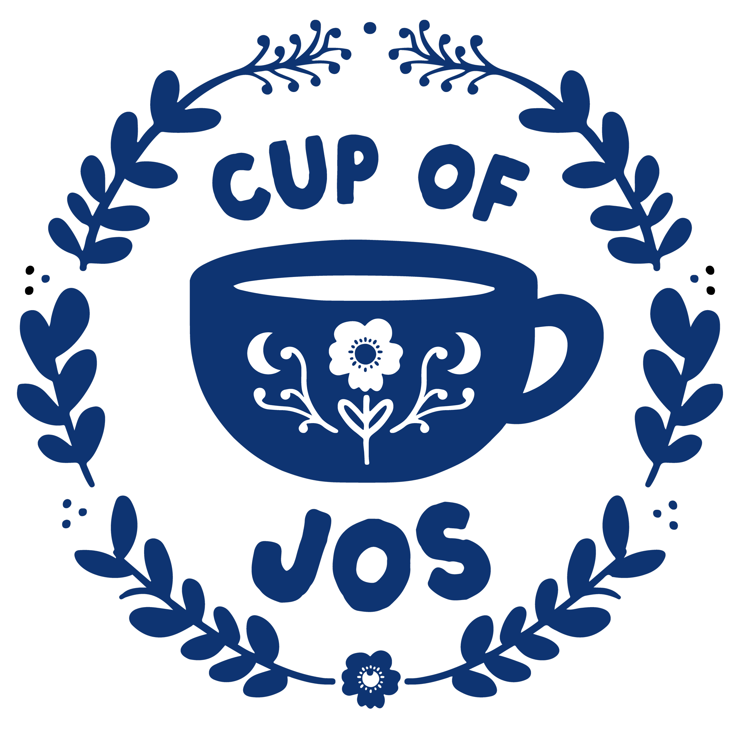
PRIMARY LOGO
The primary logo is used on packaging and round elements. The decorative leaf wrap is only utilized in the round logo.

HORIZONTAL LOGO
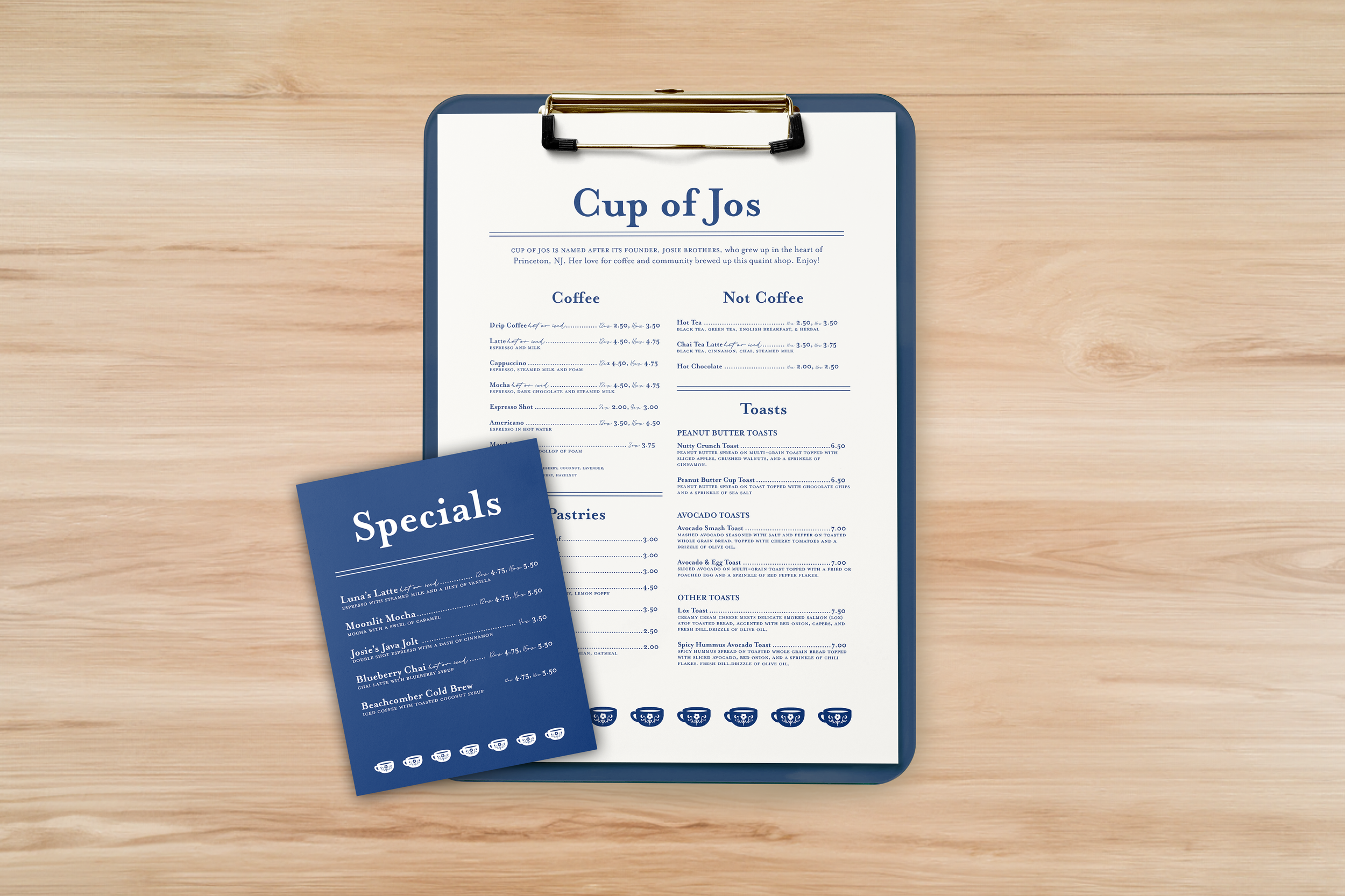
The horizontal logo is used in other marketing materials when the primary logo does not fit
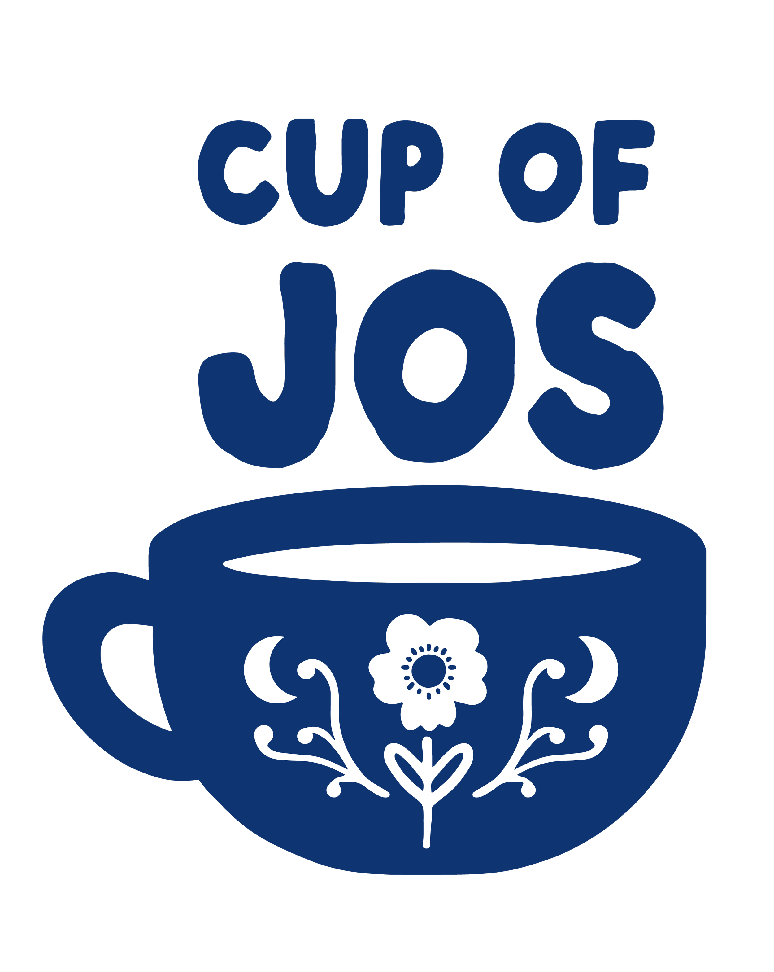
VERTICAL LOGO
Used least out of the three designs, the vertical logo is used in thin spaces where wider designs cannot fit.
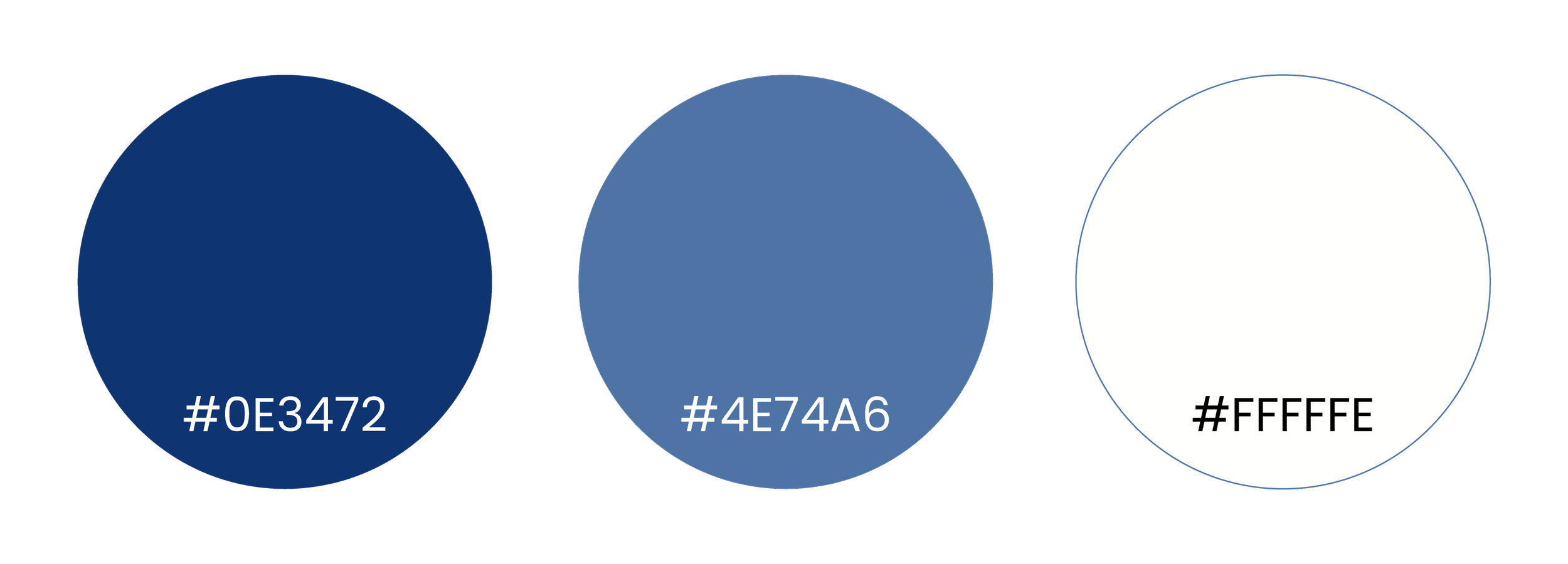
COLORS
The colors of Cup of Jos are modeled after blue and white china dishware and toile. These floral patterns are favorites of Josie’s and were requested to be in the branding of the shop.